The Wonder of Color: How to Choose the Best Hues for Your Home
Color. It’s all around us. But what do we really know about it? Color can be thought of as an unspoken language. It can bring about a spectrum of emotions. From what it says about you to the way it makes you feel, color can impact every day of your life. So, it should come as no surprise that where interior decorating is concerned, choosing the right color scheme can be one of the most important design decisions you make.
Let’s explore the wonder of color and how to choose the best hues for a happy and soulful home.
Setting the mood
Experts agree that the first thing you should do when deciding on colors for your home is determine what mood you’re looking to create for the space. Are you going for a soothing and calming effect, or something bold and playful? Here are some easy color guidelines to help you decide on the best colors for your space:
- Red: This hue is the most intense color in the spectrum—and for good reason. Red brings about feelings of energy, love, and strength. It has even been known to increase appetite, which makes it a great choice for kitchens! When you’re looking to warm up a room, red is the perfect choice to turn up the heat.
- Pink: When you’re looking for a softer look, pink is the perfect choice. Pink brings about a nurturing and compassionate vibe and can make a room feel playful and warm. Just be cautious where and how you’re using it, as this beautiful shade can turn too “girly” quickly.
- Yellow: Just think of the sun, and you’ll know that yellow brings a sense of joy, energy, and happiness to a room. Experts agree that yellow is a great choice for kitchens, dining rooms, and bathrooms, and it also offers a welcoming feel when used in hallways. A word of caution here is not to overdo it: Using yellow sparingly can be uplifting—just be sure to choose a shade that is not too bright or dull.
- Orange: If you’re looking for a color to spice up a room, orange is your best bet. This tropical color brings enthusiasm, joy, and stimulation to a room. Think exercise rooms. And like the color red, orange is known to stimulate the appetite, making another great choice for kitchens. Varying shades of orange—such as apricot and terra cotta—can bring a soothing effect to a room.
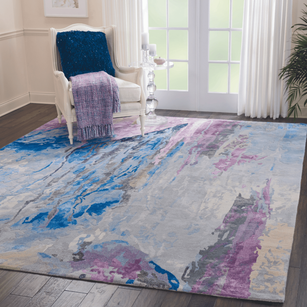
- Blue: Did you know that blue is the most popular color in the U.S.? Contrary to the saying, “having the blues,” this popular hue is not only a mood booster but it may also have a positive effect on your health. It is thought to have a calming effect, as it helps to lower blood pressure while being beneficial to the mind and body. Trust, loyalty, and confidence are just a few of the feelings evoked by the color blue. If you’re one for darker shades, midnight blue is a beautiful choice when you’re going for a luxurious vibe. Think bedroom.
- Purple: Ask any interior designer and they’ll tell you that purple is their go-to color for adding just the right touch of drama, intrigue, and sophistication to a room. If you’re looking to create a soothing vibe in your space, lighter shades such as lavender will do the trick. And here’s a fun fact: Did you know about 75 percent of pre-teens choose purple over any other color for their bedrooms?
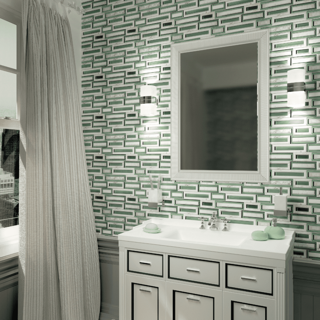
- Green: There’s no denying that green is the most soothing color. (It’s the color of nature, after all.) Symbolizing harmony, freshness, and growth, green stands alone as the one color that truly brings a sense of calmness and tranquility to a room. And the best part: Green is so versatile that you can apply it to an entire room without overpowering the look.
Coordinating the look
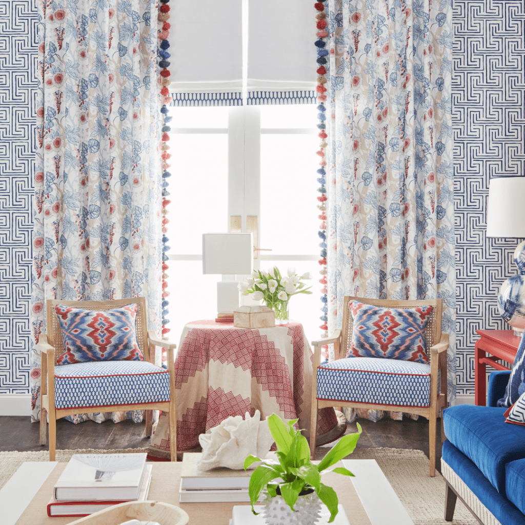
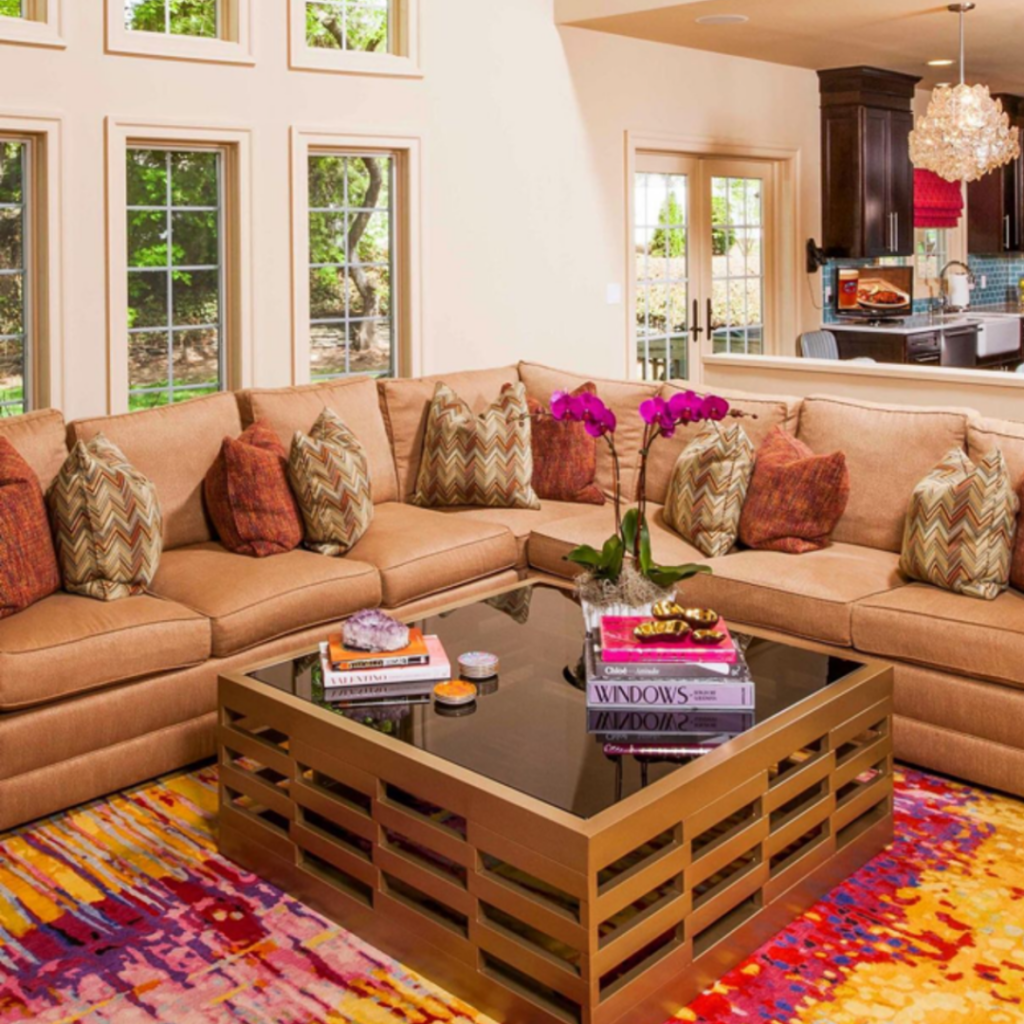
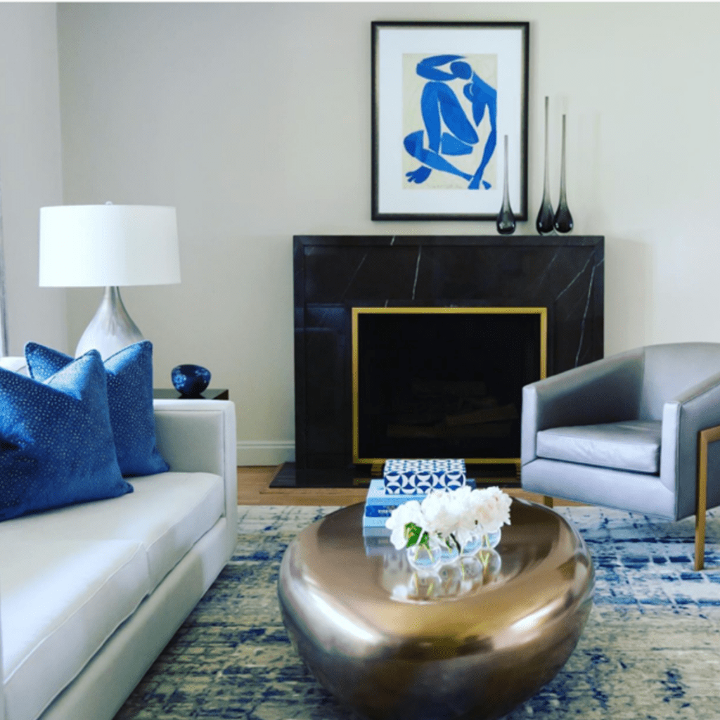
Design experts agree that the ‘rule of three’ is the gold standard when planning a beautiful and balanced décor. Any odd number will work for this formula; however, the rule of three, or the ‘60-30-10’ rule, is the most popular. Here’s how it works: Choose three colors that suit your favorite look. Choose a main color, a secondary color, and an accent color. Then, apply the following rules to pull the look together:
- Main color—60 percent: The main color you choose will represent 60 percent of your room’s color theme. Items such as flooring, carpeting, an area rug, select pieces of furniture, wall color, and even window treatments are all examples of where your main color will appear. Experts agree that the color can appear in prints as well—just as long as the main color is dominant.
- Secondary color—30 percent: Think of your secondary choice as the contrasting color to your trio. Representing 30 percent of your color theme, your secondary color choice shouldn’t compete with your main color. Instead, it should add interest, depth, and character to your space.
- Accent color—10 percent: Your accent color may turn out to be your favorite color of all. Choose a hue that will bring excitement and interest to your room, and one that you’ll love seeing throughout the space.
We hope our blog has inspired you to think about color in a whole new way. A Country Carpet expert will be more than excited to work with you in helping to choose the perfect colors for your home design. You can schedule an appointment at a time that works best for you. And walk-ins are always welcome.
We look forward to hearing from you and working with you on your project. What’s your favorite color? We would love to know!